

Prints
While the artist does not receive any direct compensation from the federal government for creating artwork for the stamps, they are permitted to produce what have become known as limited edition prints from their original designs and market them to wildlife art enthusiasts and stamp and print collectors.
It may come as a surprise to many collectors, to find that Jay N. "Ding" Darling was not the first artist to produce prints from his federal waterfowl stamp artwork.
The first artist was Richard Bishop in 1936 (see Figure 1). Bishop pulled his own prints and one of the major outlets was Abercrombie & Fitch in New York. The edition size was not limited. In fact, Bishop is known to have produced a relatively large number of prints (in many different batches) throughout his lifetime, including a quantity shortly before his death in 1975 (see Figure 1).
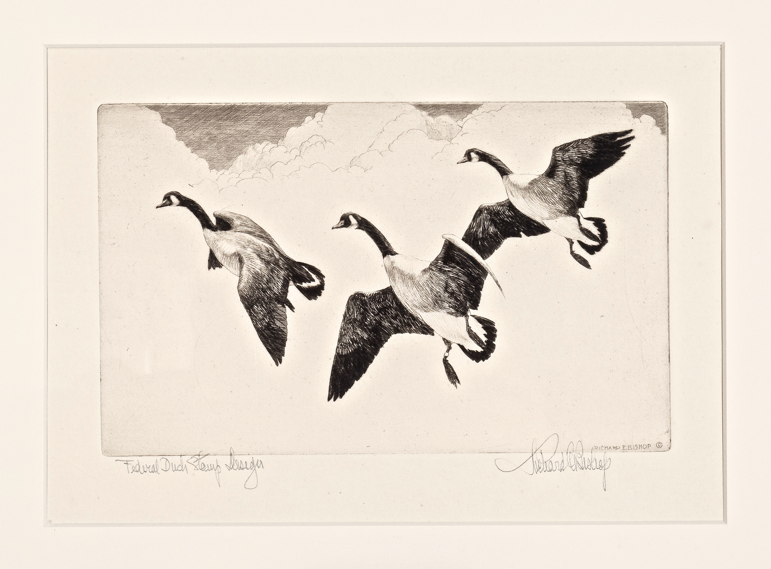
Figure 1. 1936 federal waterfowl stamp print (matted), by Richard Bishop.
There are Two Versions of Darling's 1934 Print
Darling did not produce prints of his 1934 design until 1944. While the edition was long thought to have been "unlimited", it was also believed to have totaled around 300 prints. Over the years, I have come to realize there are two different versions of Darling's print and have suggested (elsewhere on this website) there may have been more than one plate created.
I explained the most common version of the print has a quarter inch space all around the edge of the image and the edge of the plate – indicated by the depression/roll. Further, on all such prints that I have examined (over fifty) Darling penciled the title and his signature between the lower (slanted) image edge and the plate mark. Not knowing which version came first, I followed convention and referred to this (more common) version as Type I (see Figure 2).
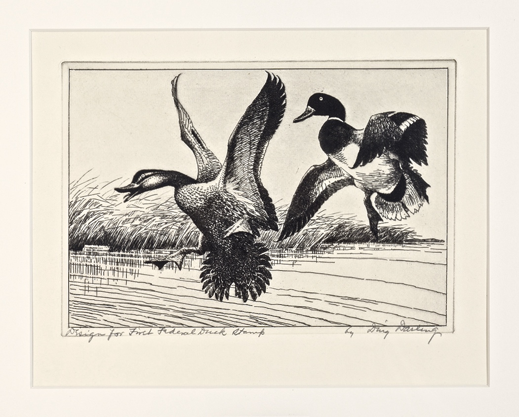
Figure 2. "Design for [the] First Federal Duck Stamp by Ding Darling" (matted). I have referred to this version of the print as Type I.
I went on to state the second version of this print (less common) has virtually no space between the image edges and the plate mark. This necessitated that Darling title and sign the prints below the plate mark. Once again, I followed convention and referred to this (less common) version as Type II (see Figure 3).
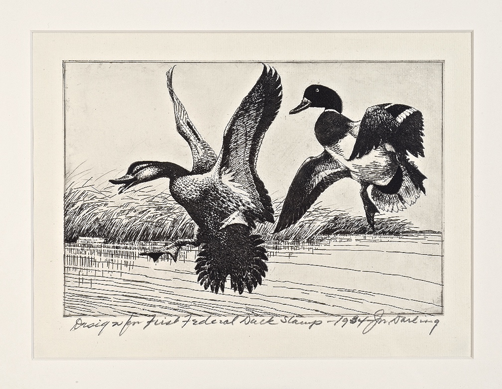
Figure 3. "Design for [the] First Federal Duck Stamp – 1934 – J.N. Darling" (matted). I have referred to this version as Type II.
Then, last year I was contacted by a collector who is a follower of our blog. He purchased a Darling print in the 2016 Siegel Sale of Bill Webster's collection of federal duck stamps and prints. It was described as having been Darling's personal copy and (despite being in lessor condition) sold for a record price.
The new owner told me he had found there was a hand-written letter by Darling accompanying the print (which was not described in the auction catalog) and this explained the two versions. Then he sent me a photocopy; as written by Ding Darling on March 28, 1954:
"... We never could find what became of the original sketch and when the request[s] began to come in for replicas of the original, the best I could do was to make a copper etching, reproducing as much [detail] as possible from memory [of] the original sketch, a copy of which you have acquired. I am not a skilled etcher and that first copper plate was worn out before the first 100 prints had been pulled. A second plate was made and the total number of etching prints from the design will run somewhere between 850 and 1000..."
Darling's letter appeared to have confirmed my hunch that two plates were made. Further, it indicates there were two separate editions. Darling tells us there were less than 100 prints in the 1st edition (from the original copper plate). At this point I began to think he was referring to the print I called version two (the least common version found today). The fact that this version showed more detail in the center of the outstretched wing and the tail feathers on the mallard to the right suggested it was pulled from the original plate, before it wore out (see Figure 4).
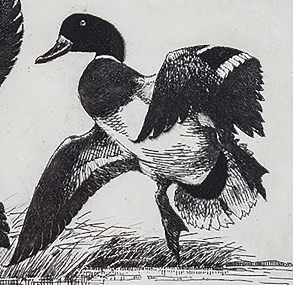
Figure 4. 1934 federal waterfowl stamp print, 2nd edition. Note the detail in the center of the wing and the tail feathers at the bottom right.
As Darling estimated the total number prints pulled from the 2nd edition to be between 750 and 900, I started to think he must be referring to the print shown in Figure 2 (the one that is more commonly found today). Note the detail in the center of the wing and at the bottom of the tail is largely absent in this version (see Figure 5).
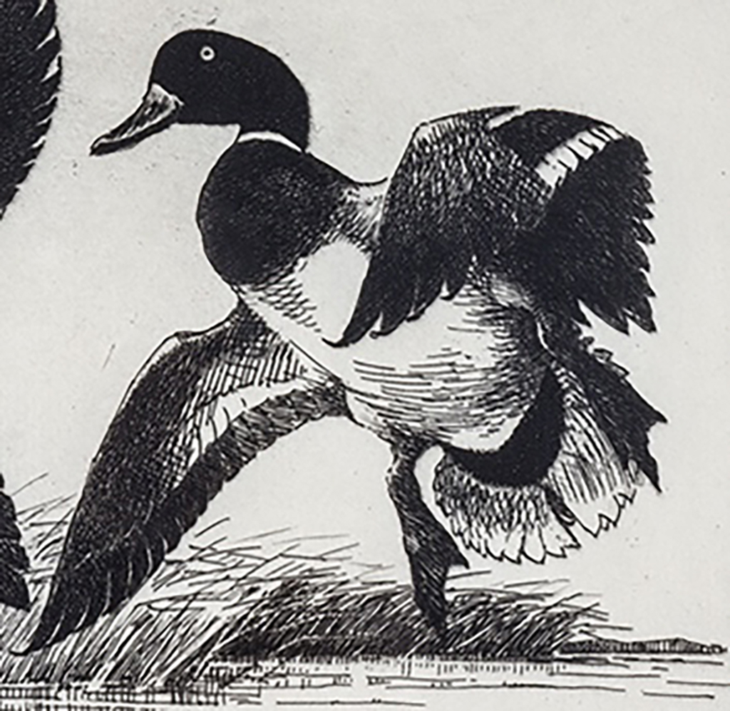
Figure 5. 1934 federal waterfowl stamp print, 1st edition. Note the detail in the center of the wing and the tail feathers is absent.
I then discussed this situation with Russell Fink, extensively. Russell has convinced me of the following: My original Type I is indeed the first version or 1st edition (Figures 2 and 5). As all prints from this edition lack the detail in the wing and tail, it must have been an artistic choice on the part of Darling when he originally etched the plate – then he changed his mind after seeing the finished product.
Once the original plate wore, Darling had the plate cut down and resurfaced with chrome. At this time, the plate must have also been touched-up to add the detail shown in Figures 3 and 4.
Therefore, my original Type II is the second version or 2nd edition and these prints were pulled from the same plate which was modified about nine years after it was originally created (the letter says the second plate was made in the fall of 1953). When Darling says a second plate was "made", he is most likely referring to the original plate being touched-up, cut down and resurfaced. Since the same plate was used – the 2nd edition is technically a second state of the 1st edition (see 1939 print below).
Although Darling estimated in the letter that "the total number of prints from the design will run somewhere between 850 and 1000", it is now clear those numbers are unrealistic. Darling tells us that less than 100 prints were pulled prior to the plate being modified and I have seen fewer of the second version. Therefore we are now left to question whether the time-honored figure of 300 may, in fact, be overstated.
As I have noted elsewhere on this website, since that time, each artist has issued (for the most part) limited edition prints of their artwork on an annual basis.
Together with artist copies of the original winning entry, this allows for a large number of people to own and enjoy a bona fide piece of art that was either produced directly by the artist's hand or with the assistance of a third party (printer and/or publisher) at the artist's direction.
The earliest federal waterfowl stamp to have a print with a set edition size is the 1935-36 (RW2) issue. When an artist produces a limited edition print, he must decide on a size for the edition. In 1935, Frank Benson chose to produce 100 prints, only. In other words, after the single edition sold out, Benson chose not to produce any additional prints (see Figure 6).
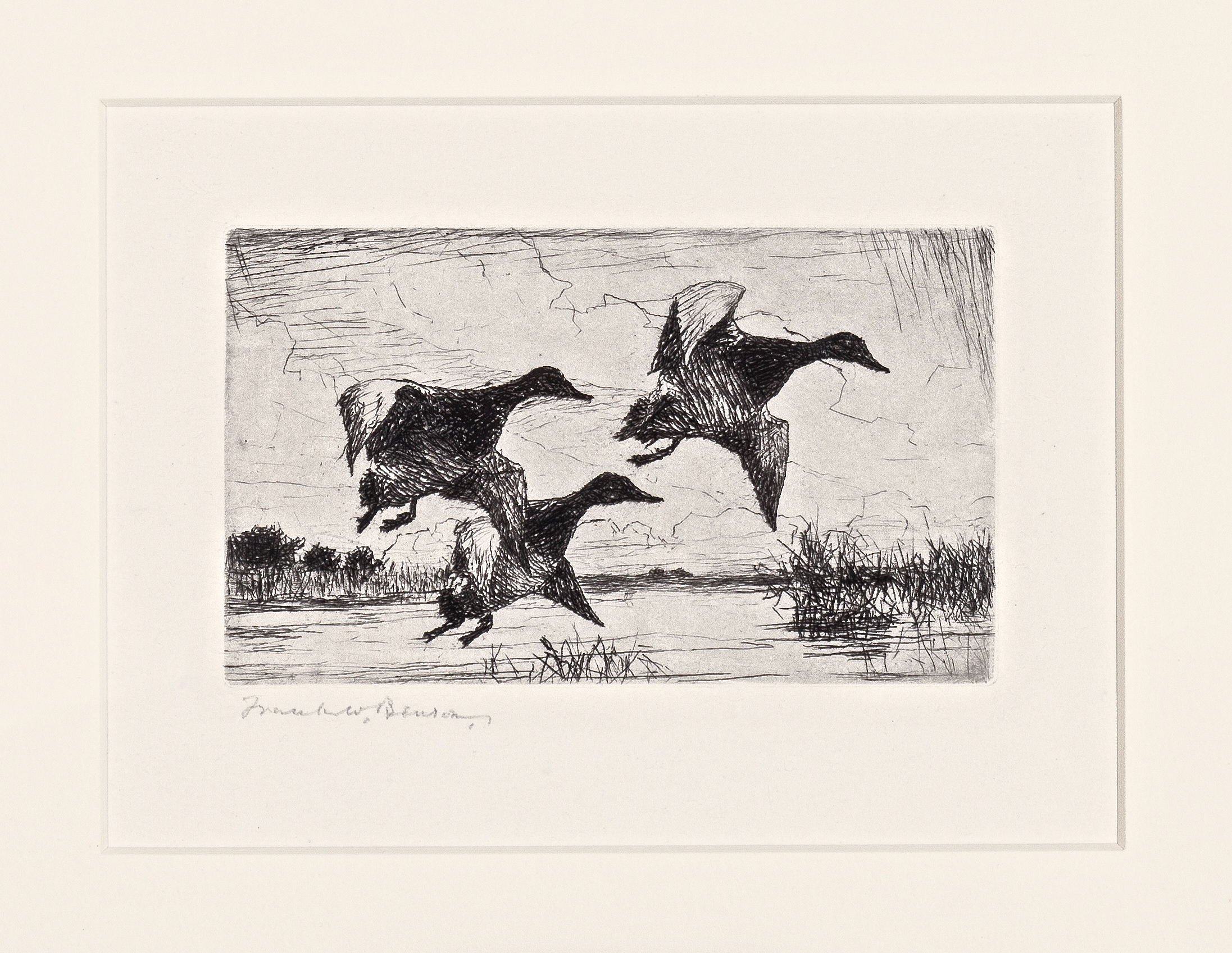
Figure 6. 1935 federal waterfowl stamp print (matted) by Frank Benson.
In 1937, artist Joseph Knap chose to have his prints published by the Sporting Gallery & Bookshop in New York City. There was one edition and, in this case, the number of prints (260) was noted in the upper right, just above the image (see Figure 7).

Figure 7. 1937 federal waterfowl stamp print (matted) by Joseph Knap.
If an edition sold out and the artist decided to release additional prints at a later date, the design was often modified slightly and these were considered to be a distinct separate edition. Depending on the demand and the artist's inclination, there could be a second, third fourth, or even fifth edition. These were often noted in pencil when the artist signed the prints.
The first federal waterfowl stamp print to have two separate editions is the 1939-40 (RW6) issue (remember Darling did not start producing prints until 1944) . Artist Lynn Bogue Hunt produce an unknown total of prints, believed to be about 200. Of these, the first 100 prints or so were numbered and titled in pencil by Hunt in the bottom left corner, just below the image. This is known as the first edition (see Figure 8).
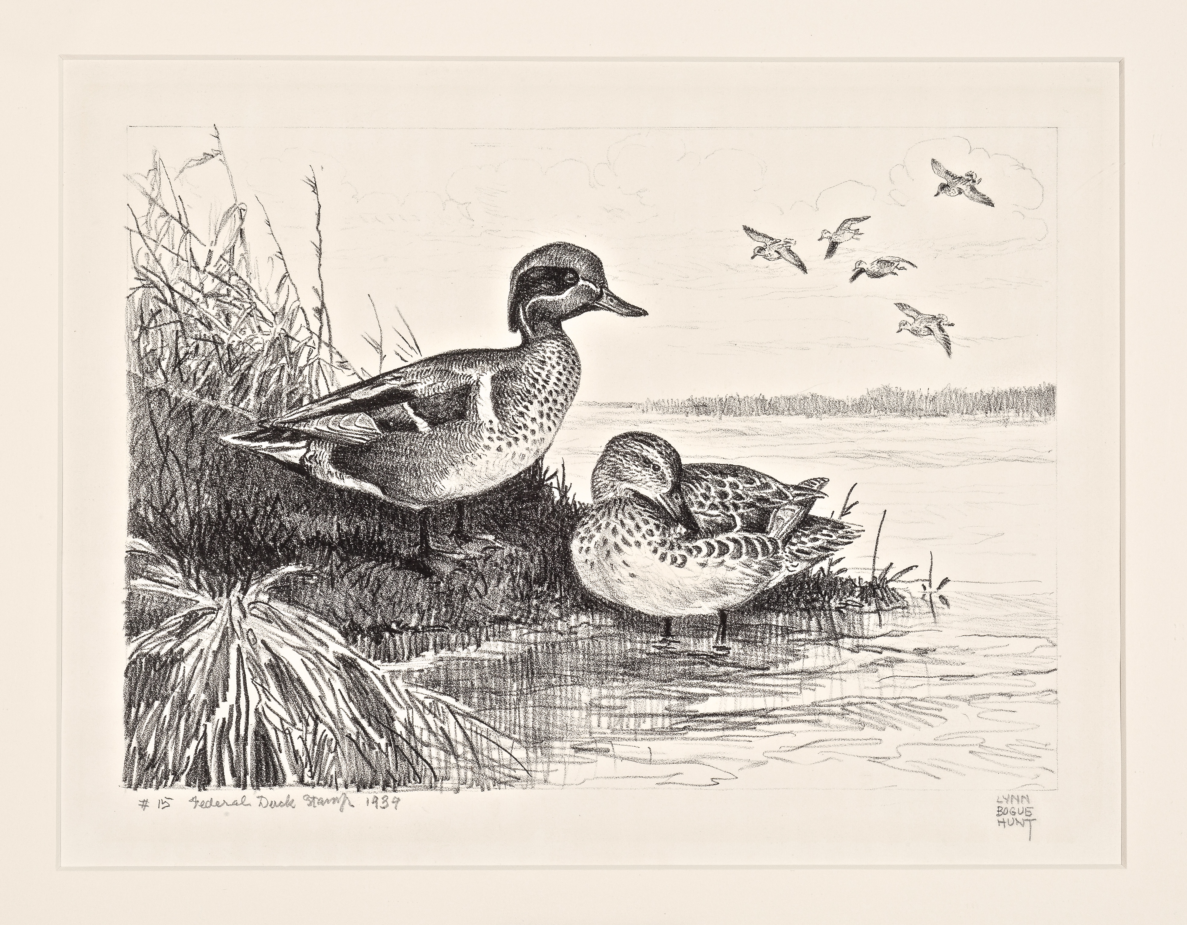
Figure 8. 1939 federal waterfowl stamp print (matted) by Lynn Bogue Hunt, 1st edition.
Hunt then reworked the same litho stone and another 100 or so prints were pulled. Hunt printed "ED. 2" in front of the title and these have become know as the 2nd edition (see Figure 9). As pointed out in Duck Stamp Prints by Stearns and Fink, since only one stone was used – the 2nd edition is technically a second state of the 1st edition.
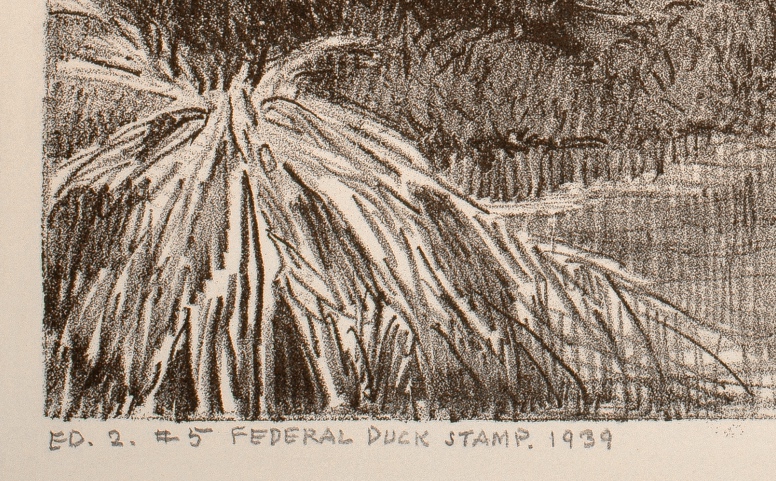
Figure 9. 1939 federal waterfowl stamp print by Lynn Bogue Hunt, 2nd edition enlargement showing "ED. 2".
Otherwise, the separate editions can be differentiated by the slight design modification and/or the method of producing the print itself. In 1940, artist Francis Lee Jaques created two separate litho stones and pulled about 30 prints from each. These are known as the first two editions. They can be identified by subtle differences in the design.
There is more than one way to tell the difference between the first two editions and I will explain the easiest, most fool-proof method. On the uppermost (right side) duck, the upper wing comes down toward the tail and then juts outward, before returning inward once again toward the duck's body. On the 1st edition, only, right above the point where the wing juts outward – there is a smaller protrusion of feathers that is shaded in. This resembles a small triangle, pointed toward the right and slightly downward (see Figures 10 and 11).
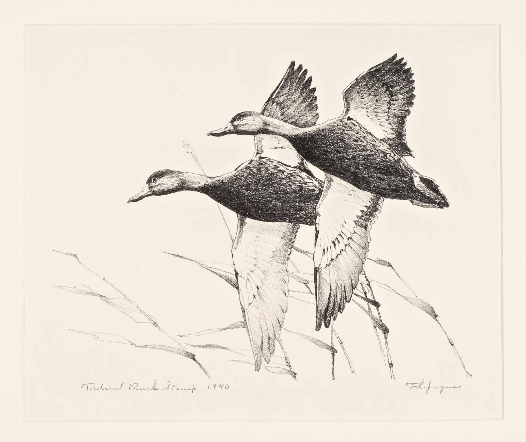
Figure 10. 1940 federal waterfowl stamp print (matted) by Francis Jaques, 1st edition.
Figure 11. 1940 federal waterfowl stamp print by Francis Jaques, enlargement showing feather protrusion on the 1st edition.
Prints from the 2nd edition have a somewhat larger feather protrusion that is not shaded in (see Figure 12). Prints from the much more common third edition (about 200 prints were pulled) lack a sort of "triangle" in the design where the upper wing meets the body on the duck at the right (see Figure 13).
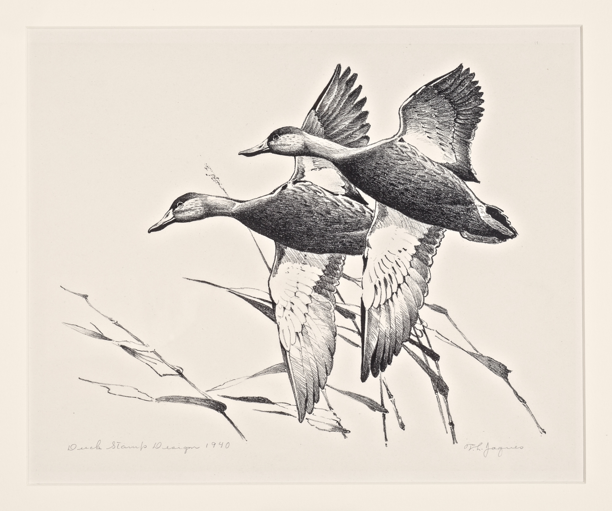
Figure 12. 1940 federal waterfowl stamp print (matted) by Francis Jaques, 2nd edition. Note the larger protrusion is not shaded in.
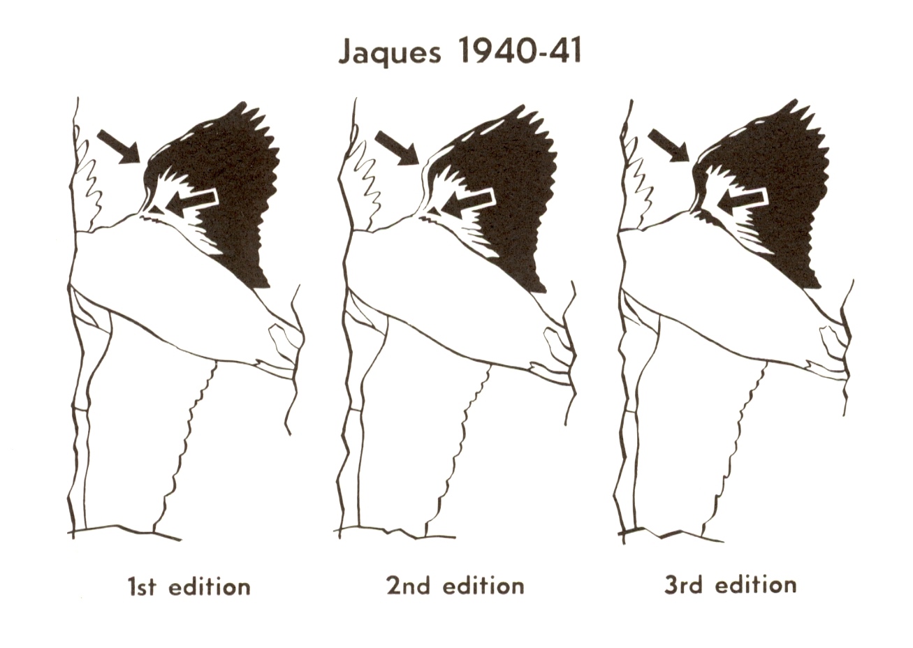
Figure 13. Identification reproduced from Duck Stamp Prints by Stearns and Fink.
1941 and 1944 1st Edition Images are Reversed
In some cases, the editions can be differentiated by their method of production. For example, Edwin Kalmbach chose to produce the 1st edition of the 1941 (RW8) prints as a stone lithograph and the 2nd edition using the fine grain gravure technique, better know as photogravure. For a detailed discussion of these two methods and more information about the 1941 prints, see My Favorite Federal Duck Stamp – Part Four.
In addition, the image on 1st edition prints is a mirror image of the original art and the vignette on the stamp. Such images are often referred to as reversed or, occasionally, as flopped. I have previously stated my belief that Kalmbach may have preferred the ducks swimming to the left, thus the reversed image (see Figure 14).
However, there must have been a public outcry when collectors and wildlife enthusiasts went to have the print framed in the traditional manner (with the stamp mounted beneath the print) and the images were not in accord. This necessitated Kalmbach coming out with a second edition of his print, with the image orientation matching the stamp (see Figures 15). Although neither edition was numbered, the 1st edition is believed to have been 100-110 and the 2nd edition around 100.
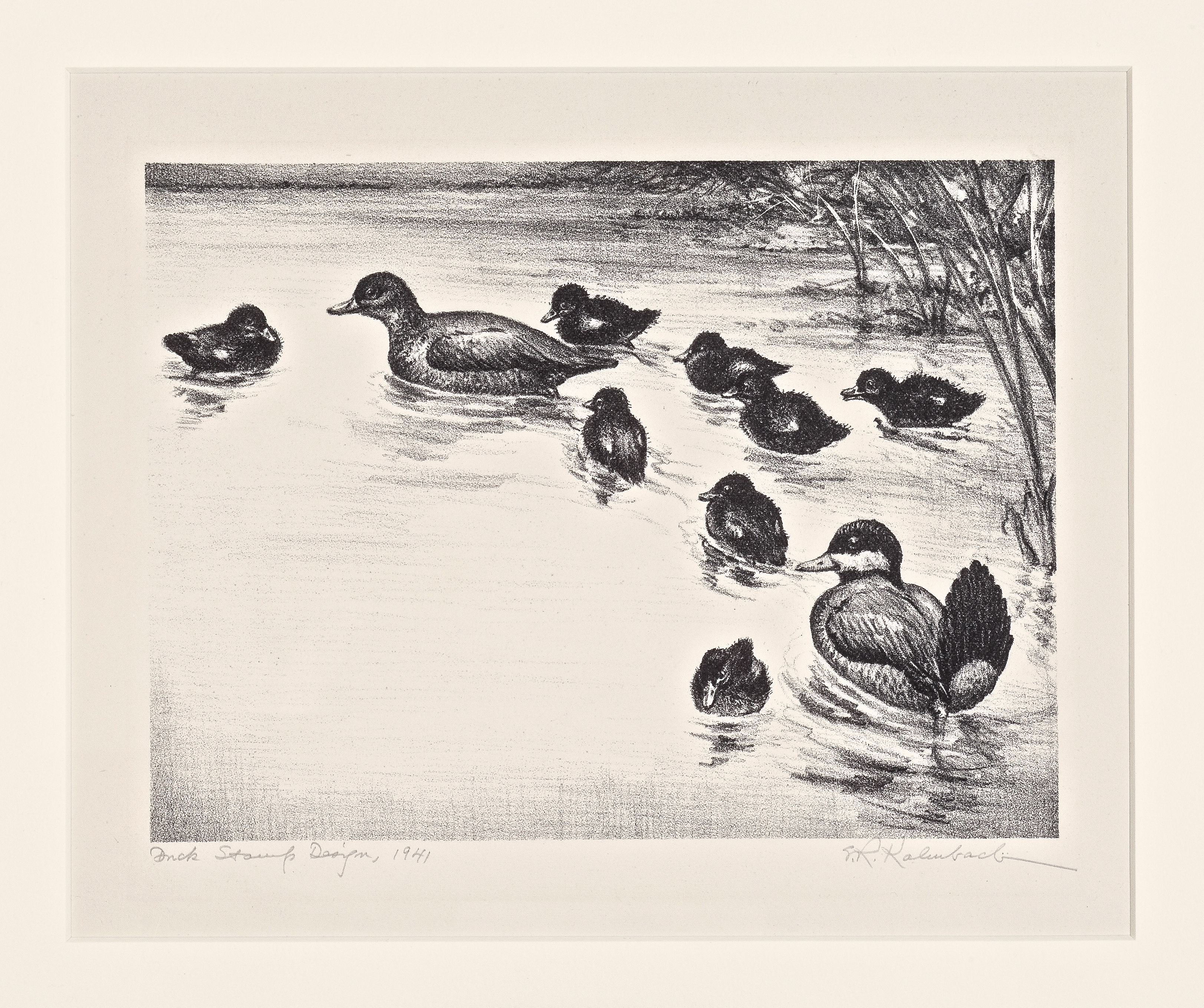
Figure 14. 1941 federal waterfowl stamp print (matted) by E.R. Kalmbach, 1st edition.

Figure 15. 1941 federal waterfowl stamp print (matted) by E.R. Kalmbach, 2nd edition.
A similar situation exists for the 1944 (RW11) stamp prints. In this case, there were three editions of Water Weber's White Fronted Geese image. All were stone lithographs. Prints from the 1st edition have the image reversed like those from 1941. However, unlike in 1941, this was an error (see Figure 16).
According to Russell Fink, a close personal friend of Walter's, he was dismayed when the litho stone was incorrectly drawn by an artist employed by George C. Miller and Son, in New York City. This was not particularly unusual for the artist to have a better technician draw the stone (known as ghosting), however, in this particular case the orientation of the image was drawn incorrectly. Weber immediately requested that a new stone be drawn and images from both the 2nd (see Figure 17) and third editions correspond to the original artwork and the stamp.
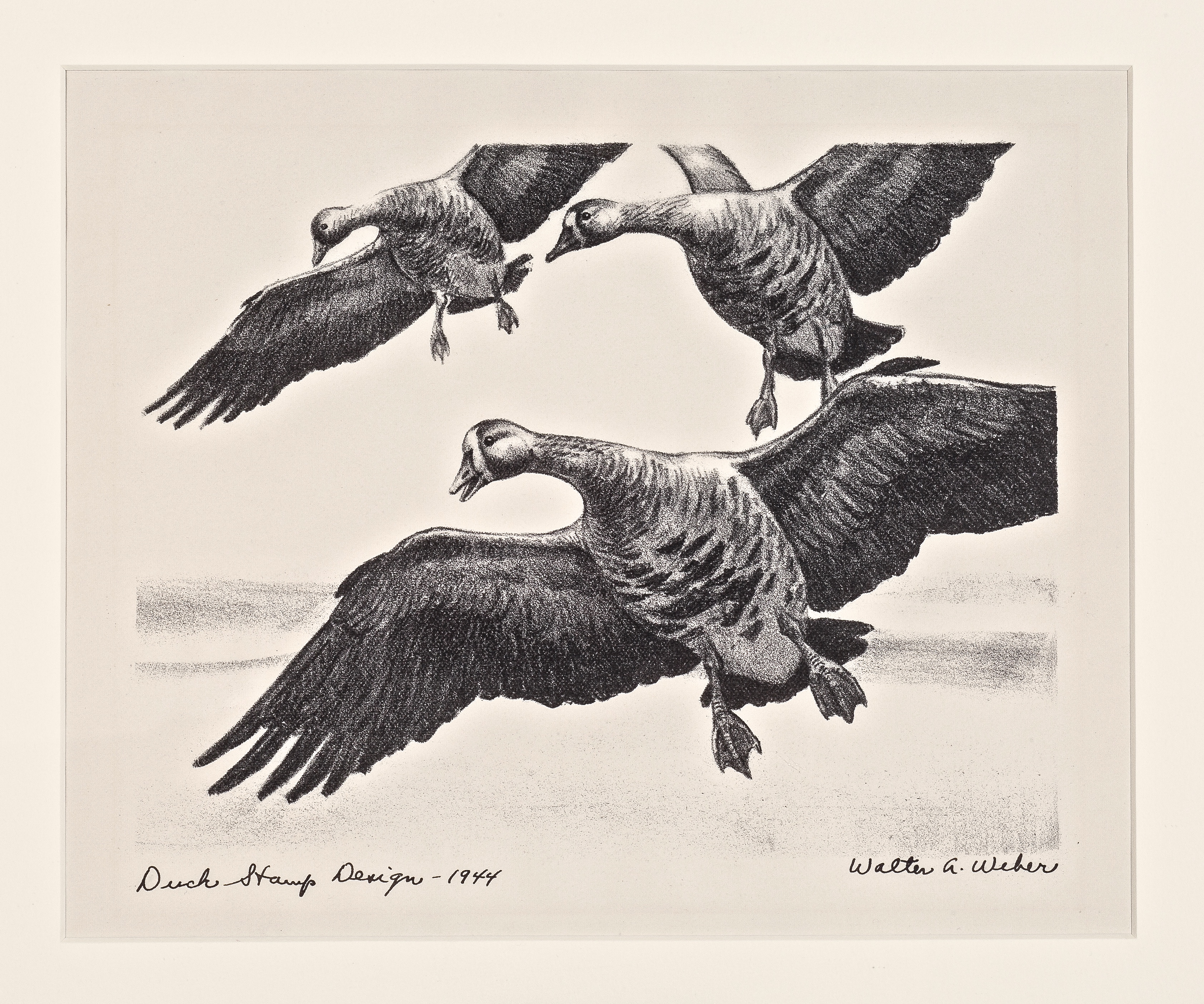
Figure 16. 1944 federal waterfowl stamp print (matted) by Walter A. Weber, 1st edition.
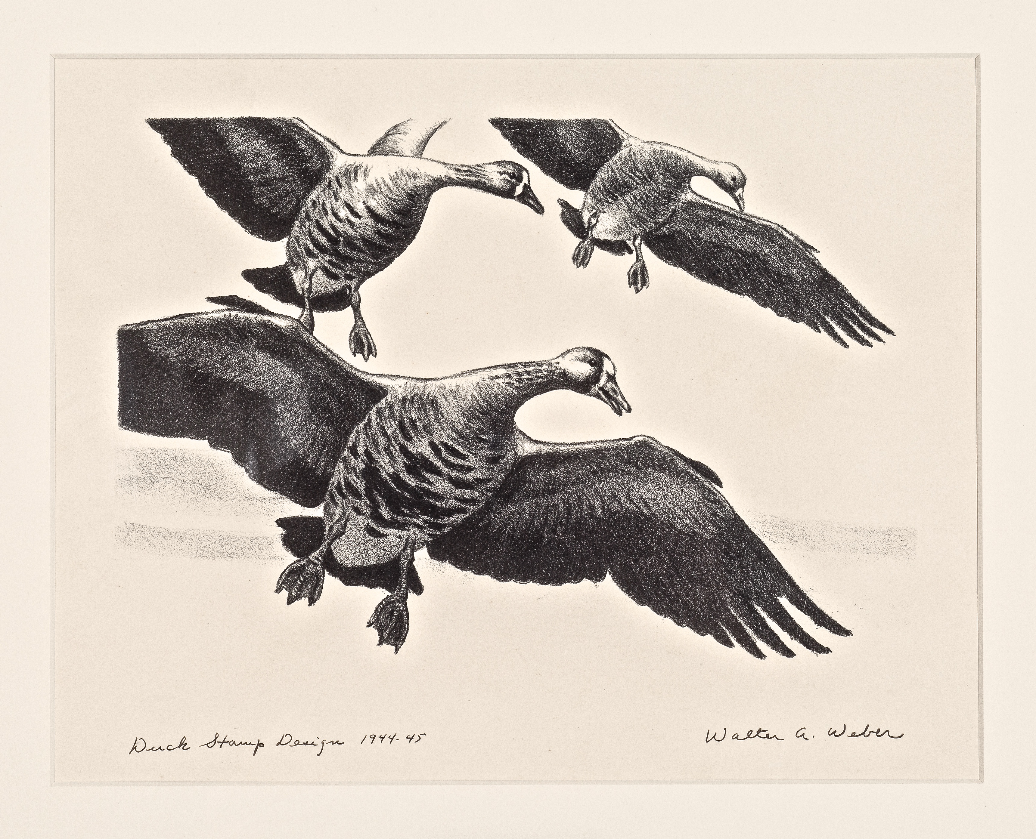
Figure 17. 1944 federal waterfowl stamp print (matted), 2nd edition.
Leslie C. Kouba chose to produce the first edition of 1958 (RW25) prints as a stone lithograph and the second edition as a drypoint etching with aquatint (see Figures 18 and 19).
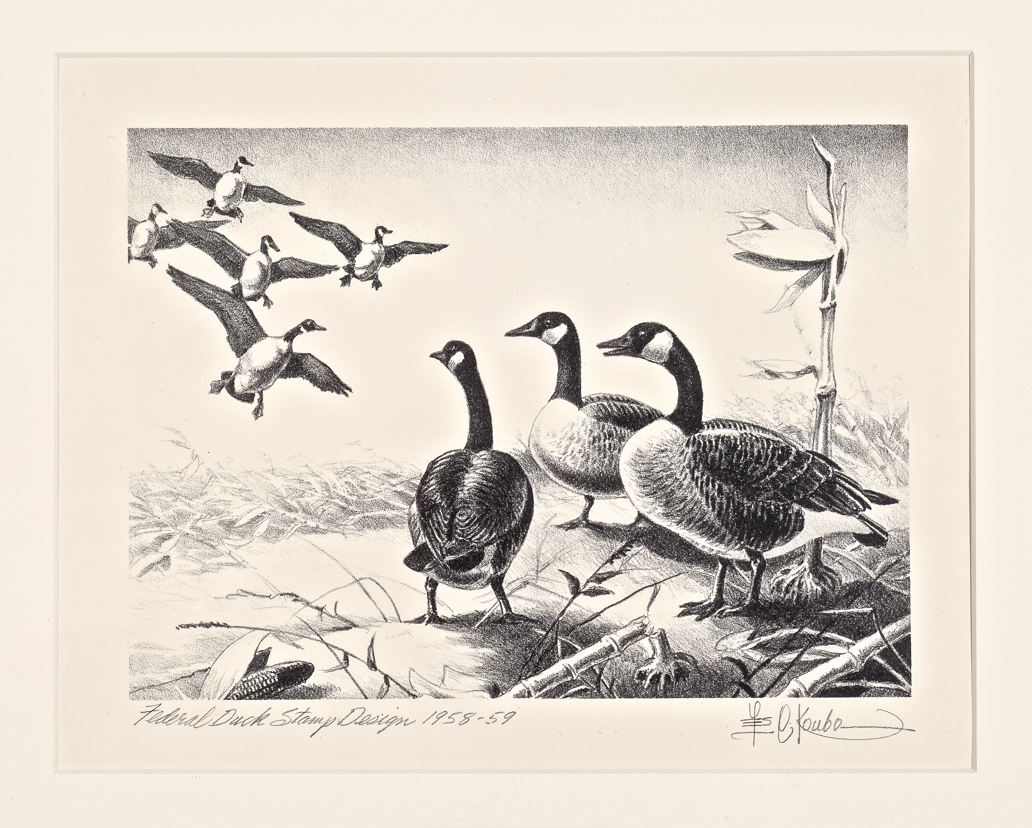
Figure 18. 1958 federal waterfowl stamp print (1st edition – lithograph, matted) by Leslie C. Kouba.
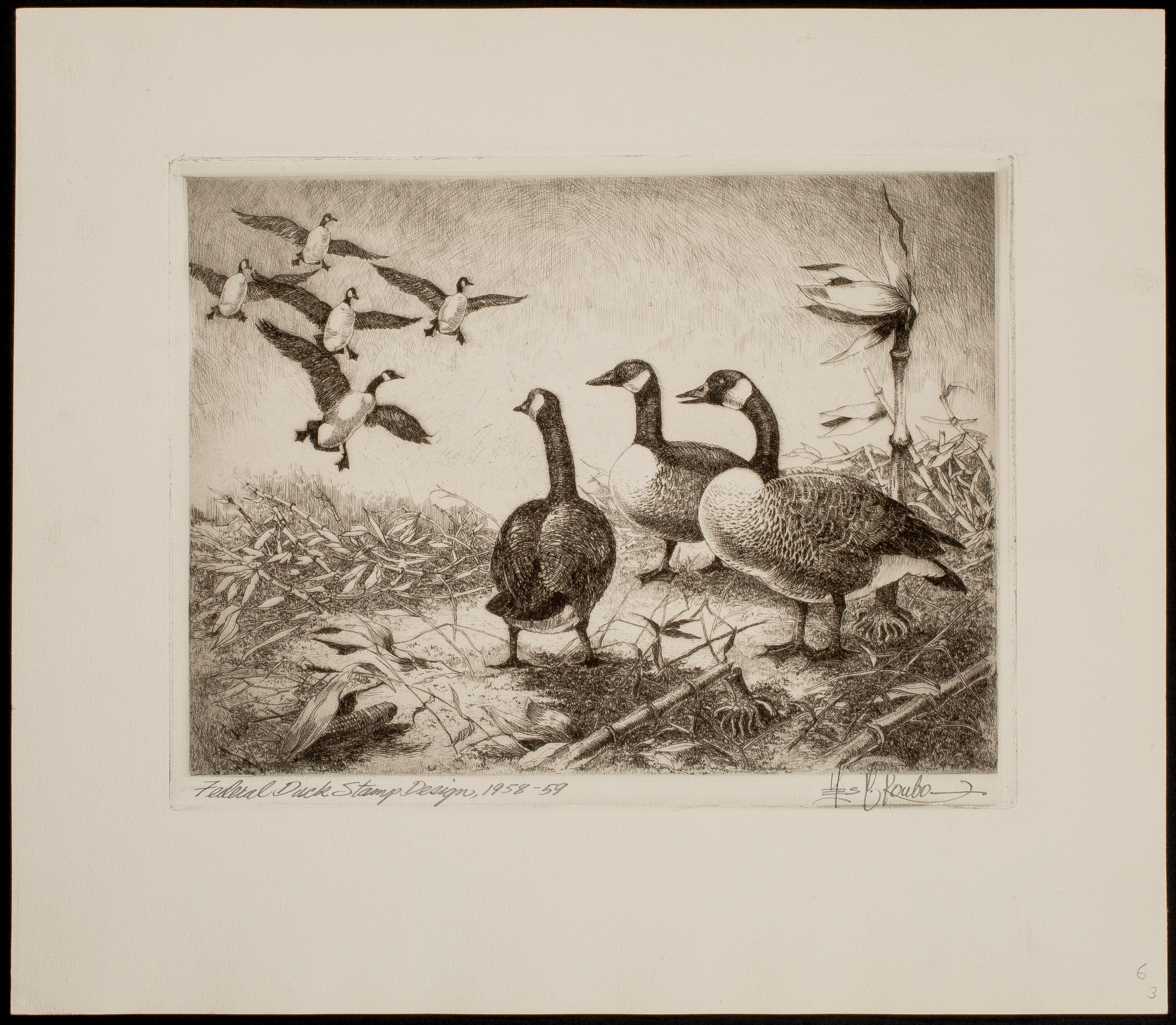
Figure 19. 1958 federal waterfowl stamp print (2nd edition – drypoint etching, never framed) by Leslie C. Kouba.
The Most Popular Stamp Print, Ever
Known affectionately as "the dog", prints made from Maynard Reece's original artwork in 1959 (RW26) are extremely popular (see John Olin, Ding Darling, Maynard Reece & King Buck: The Making of an Icon). There have been five separate editions to date, with the first four being stone lithographs. Prints from the 3rd and 4th editions are labeled as such so there can be no confusion there.
However, prints from the 1st and 2nd editions were not labeled. I will explain the easiest way to differentiate prints from these two editions. Maynard included a number of ducks in the background on both editions. If the upper wing of the background duck furthest to the left is completely below the tip of the plant above it – you have a 1st edition print (see Figures 20 and 21). If the upper wing overlays the tip of the plant, it is a 2nd edition print (see Figure 22).

Figure 20. 1959 federal waterfowl stamp print (matted) by Maynard Reece, 1st edition. Note the upper wing of the background duck furthest to the left is completely below the tip of the plant.
Figure 21. Enlargement of background duck detail, 1st edition.

Figure 22. 1959 federal waterfowl stamp print (matted) by Maynard Reece, 2nd edition. Note the upper wing of the background duck furthest to the left overlays the tip of the plant.
Through 1969 (RW36), all federal first edition prints were produced in some shade of black ink on a variety of white papers. The method of production in the vast majority of cases was either engraving or lithograph.
Starting with the two 1970 (RW37) editions by Edward J. Bierly, all federal waterfowl stamp prints were produced in multicolor (see Figure 23). This coincided (and quite likely contributed to) the boom in collecting waterfowl stamp and limited edition prints, in general, that took place during the 1970s.
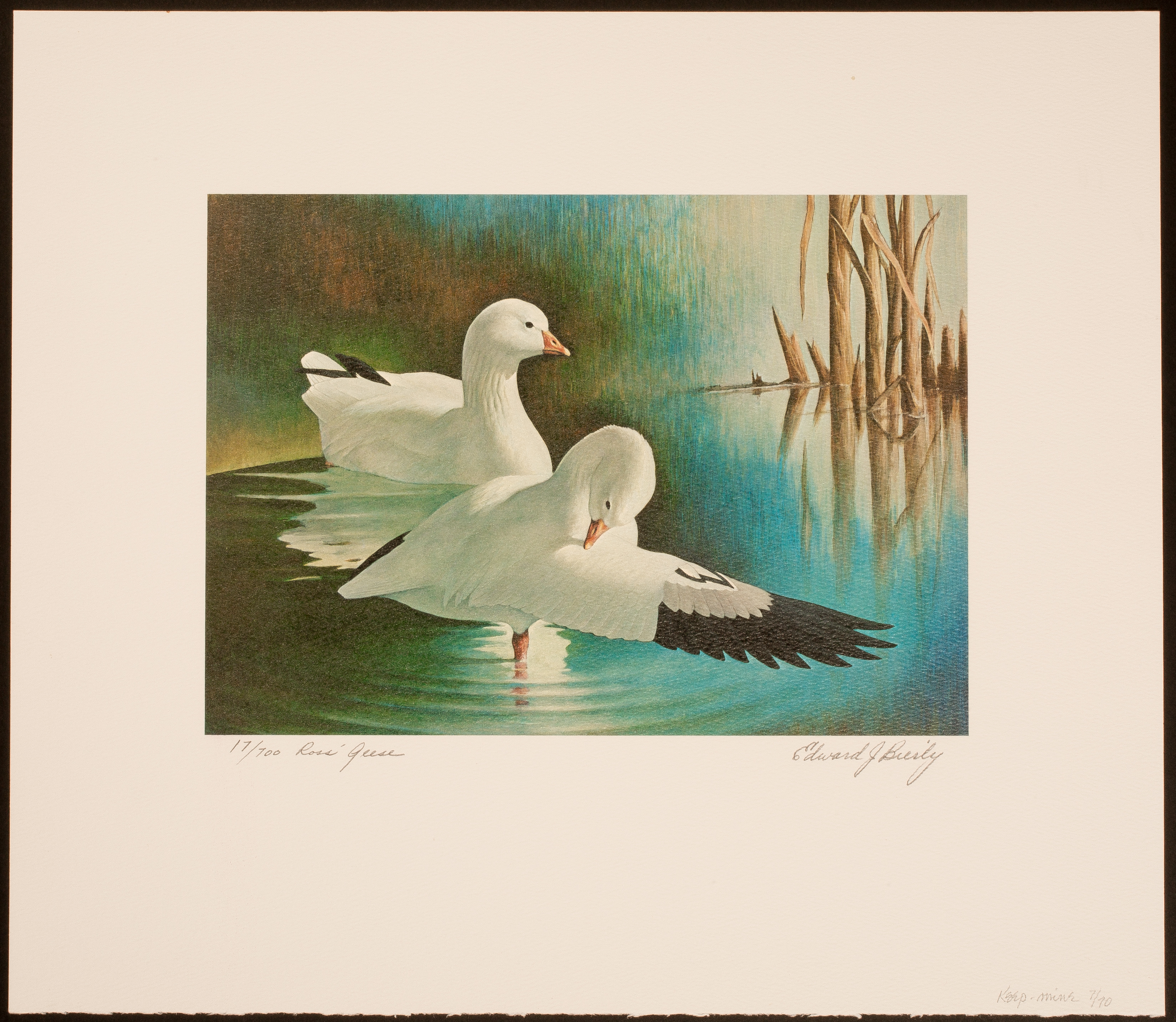
Figure 23. 1970 federal waterfowl stamp print (1st edition – never framed) by Edward J. Bierly.
Not only were the prints available in full color, the collector was often able to secure a small original embellishment on the print itself, done in the artists own hand. This miniature original art addition was sometimes drawn in pencil and sometimes (at a higher fee) drawn in color. It is known as a remarque (see Figure 24).
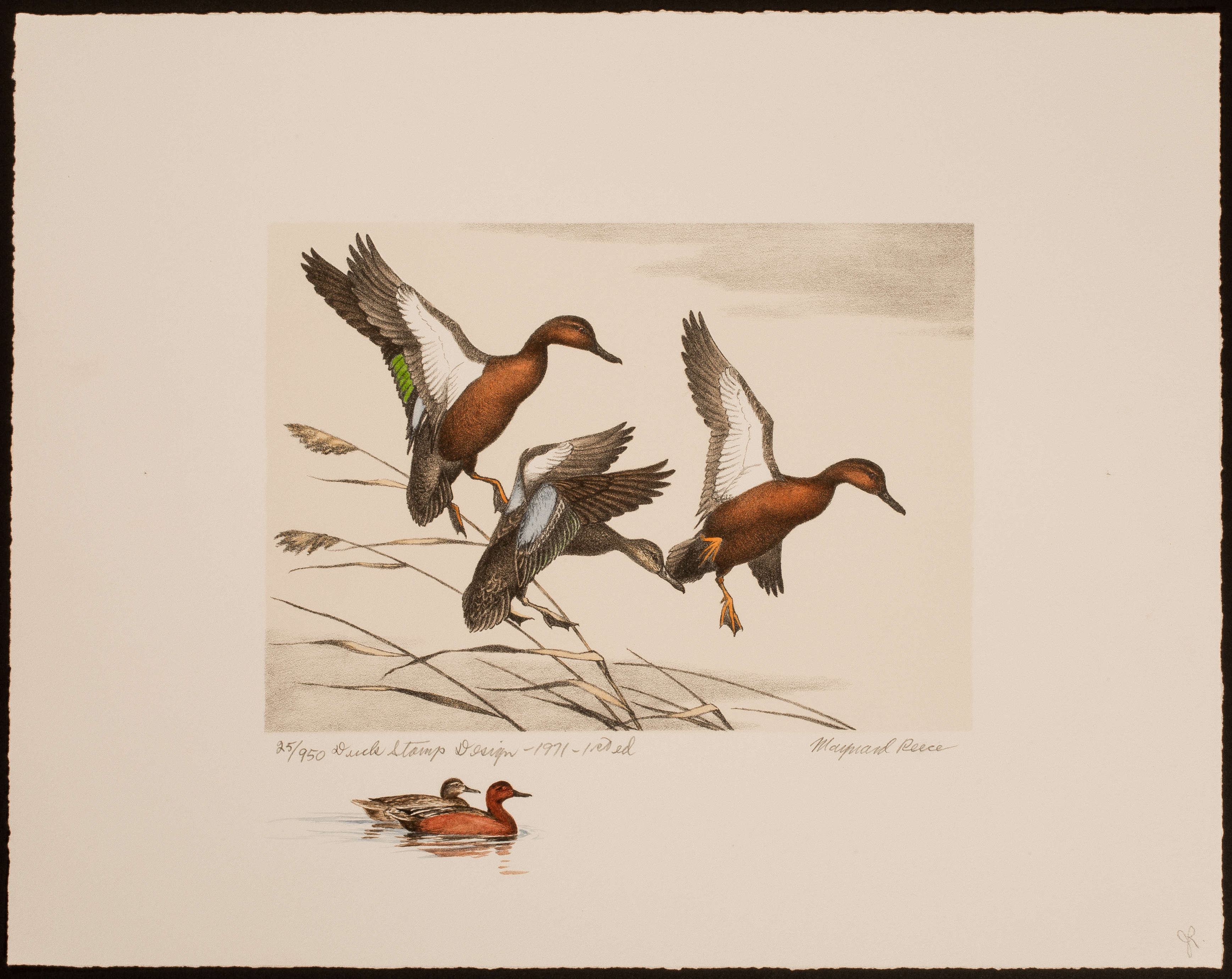
Figure 24. 1971 federal waterfowl stamp print with a color remarque by Maynard Reece.
The 1974 (RW41) print, released by artist David Maass through Wild Wings of Lake City, MN, was a revelation during this period of exponentially increasing interest in limited edition prints.
The artwork was exceptional, the artist was enjoying widespread popularity and the demand for wildlife art was at an all-time high. Sensing this "perfect storm", Wild Wings President Bill Webster took the unusual step (during this time) of making the edition size unlimited.
Prior to 1974, no federal waterfowl stamp edition had ever exceded 1,000 prints. Although not common knowledge, Bill told me that actual sales figures for the Maass piece approached 4,000 prints! This gives you an idea of the fever-pitch that existed during this time. The 1974 print is still very popular today (see Figure 25).
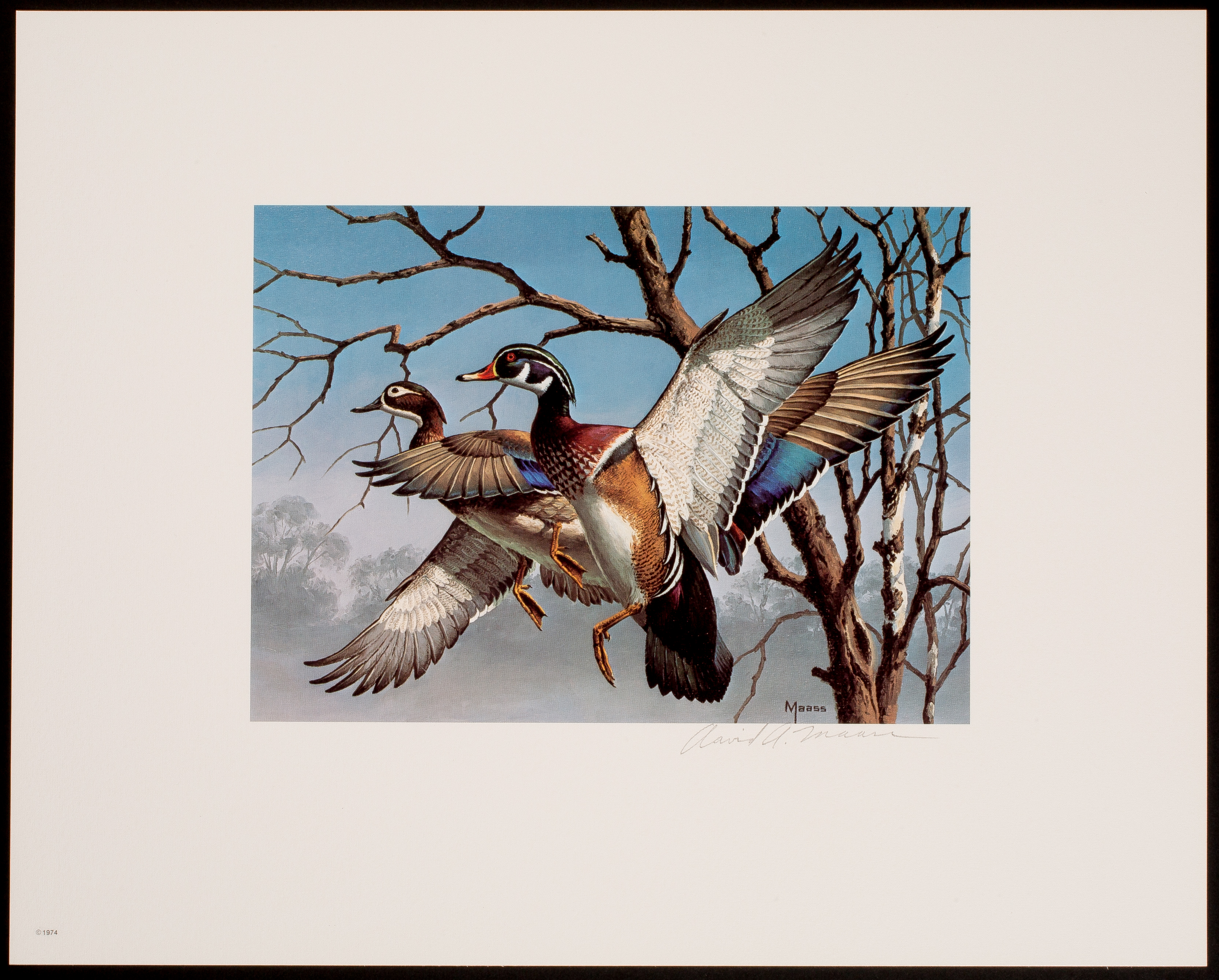
Figure 25. 1974 federal waterfowl stamp print by David Maass.
The 1976 (RW43) print is an interesting case. While at first glance it appears to be printed in black ink on white paper, it is a true multicolor piece. According to Duck Stamp Prints, by Stearns and Fink, three colors were used: warm black, cool black and sepia (see Figure 26).
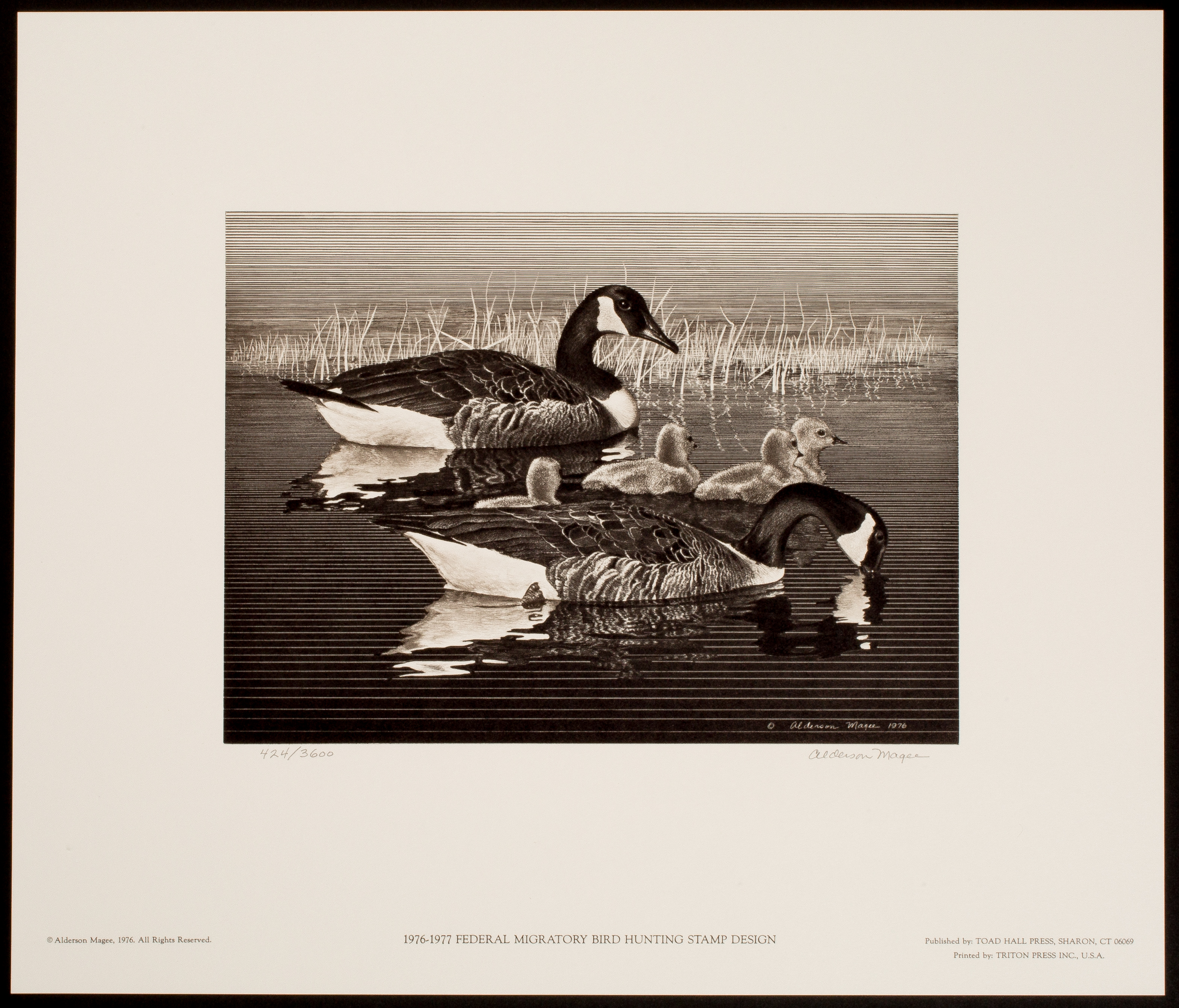
Figure 26. 1976 federal waterfowl stamp print by Alderson Magee.
1983 (RW50) marked the 50th anniversary of the federal waterfowl stamp program. To Commemorate this event, the artist, William Morris, produced a special Anniversary Edition which included a gold-colored circular medallion.
Interest in the medallion edition was very high (I sold 275, myself) and this became a precedent-setting event. From this point on, every artist offered a medallion edition in addition to what (then) became known as the regular edition.
Condition (1934 – 1969). Early (black and white) federal waterfowl stamp prints were sold and (usually) framed during a period of time prior to today's "museum" standards. In virtually all cases, the mats were highly acidic and the prints were held in place by tape, glue or dry-mounting adhesive.
There was no widely available UV resistant glass or acrylic (plexi-glass) to choose from. In addition, the prints were often framed repeatedly over time. This frequently resulted in the size of the original margins being cropped (trimmed) with each successive framing.
A talented conservator can often remove tape and dry mount residue, mitigate the effects of acid burn from the mats and discoloration from the sun or UV emitting lights (such as flourescent tubes) and otherwise stabilize the piece. However, the original margins cannot be restored.
Therefore, when purchasing an early federal print, it is wise to keep two things in mind: 1) the cost of professional conservation (often referred to as restoration) has risen dramatically over the last 20 years and 2) if a print has less than one inch margins at the top, either side or below the signature – the piece is considered to have a serious defect and should be valued accordingly.
On the other hand, prints that have already been properly conserved or restored by a qualified professional and have adequate margins should definitely sell for a premium going forward. If an early black and white print has never been framed, the premium may be substantial.
Condition (1970 – Date). Starting in the late 1970s and well under way by the early 1980s, there was a revolution of sorts within the framing industry. Museum standards became adopted, gradually, from coast to coast.
The primary principle of museum standards is that nothing should come into contact with the piece of art (in this case a print) that is not completely acid free and ph neutral.
This includes mat board and foam core board (typically, the foam core serves as backing and is place behind the mat board). This results in the elimination of discoloration (more pronounced along the beveled or otherwise cut edge of the mat board immediately surrounding the image area) that is otherwise produced by the leaching of acid from the board into the paper the art is printed on.
The second level of museum standards calls for the complete elimination of tape – even so called acid free or "museum quality" tape – and using corner mounts to affix the art to the mat board.
Do not allow yourself to be convinced otherwise by framers claiming to use museum tape that is "completely" or "easily" removable. My experience with these products is that, after a period of time, they are more difficult to remove than ordinary masking tape.
Commercial photo corner mounts have a hard edge that, after a period of time, may result in impressions in the corners of the print. The best way to deal with this is to offer to pay the framer a little extra to hand-tear and fold corner mounts from acid free paper. The torn (ragged) edge is positioned so that it comes into contact with the print. The torn edge results in the elimination of the hard edge and any subsequent indentations.
The final element to museum standards is to use UV resistant glass or (preferably) acrylic to help protect the framed art and any stamps from the deleterious effects caused by sunlight and certain kinds of artificial light. With multicolor prints and stamps, prolonged exposure to UV light can result in irreversible fading.
Please note I stated UV resistant. One should still avoid placing the art on a wall that is exposed to direct sunlight, as UV resistant products do not last forever. The products contain thousands of molecules that each neutralize a photon of light. Once all of the molecules are used up (six months to ten years depending upon exposure) – you are left with an ordinary glazing product. In other words, the UV glass or acrylic must be changed periodically.
In general, colored federal waterfowl stamp prints that have not been framed according to museum standards – have greatly diminished to zero collector value. This is in direct relationship to the age of the piece (and the gradual adoption of the standards). The cost of restoration now exceeds the retail value of all but the first few (1970 – 1976) colored prints. Please bear this in mind when it comes time to sell.
The Torre-Webster Federal Waterfowl Stamp Print Archive. For decades, Bill Webster and myself were the only collectors to succeed in acquiring a print from each addition for every year. I believe that a few others may have duplicated this feat in recent years.
When the Bill Webster Sale was held by Robert A. Siegel Auction Galleries in March of 2016, I attended and was fortunate to win every lot containing: 1) any paper varieties I was missing and 2) any prints Bill had that might represent a possible upgrade.
This was done with the sole intent of presenting a comprehensive collection on this website for reference purposes. Unfortunately, I made an error years ago and when it came time to photograph the combined collection, found for RW7 (1940) I had a first and two second edition prints – as opposed to the first, second and third I wished to show. When I locate a nice third edition, I will update this archive.
To see the 1934 – 1969 federal waterfowl stamp prints, click here.
To see the 1970 – Date federal waterfowl stamp prints, click here.